Imps! designing the logo
The background to this page is the result of testing a wide range of free fonts to evaluate their suitability for the Imps! logotype.
In most cases this was a way to discount some of the naffer approaches quickly - but there are some unexpected ideas worth developing.
This is the version first used on the site, drawn up using a Wacom graphics tablet, point by point in Adobe Illustrator CS:

Imps! is a very short word, so the common restrictions of keeping it simple and clean to improve readability are less crucial. It might even be possible to run the word vertically as the 'i' above the 'm' will work as a trident.
This is no grey corporate brand - Imps! should look bold, rash and full of energy. Something of the medieval gothic here and there while staying vibrant and current.
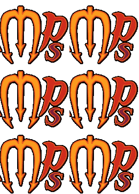
Version 2 exaggerates the 'm' and distorts the word to make it unique. The 'i' has been made from part of the 'p' to make a slightly more symmetrical logo:
 |
|
it also introduces some limited animation to the flame, done as an animated gif in Adobe Imageready. Each frame has been wobbled a little using the 'liquify' filter. To keep the file size as small as possible only the flame itself animates, so it has been done as a slice.
Having established the look, this has been taken through to the little 'home' rollovers on pages such as this (see below left). These have been added as a 'library' item in Dreamweaver, which makes future changes to the logo rollover much faster to apply across many pages at once.
Logos created for the links page 
